




A website can have all the right information and still leave people stuck. Granite Edvance helps students and families plan for education, navigate financial aid, and find ways to pay for what comes next. But across the website, small points of friction were making that journey harder than it needed to be.
This wasn’t a full website redesign. The goal was more focused: improve the two places that had the greatest influence on how people moved through the experience — the navigation and homepage.
Rather than jump straight into recommendations, we started with stakeholder interviews so those changes could be grounded in the real questions, behaviors, and pain points students and families were experiencing.
The challenge wasn’t more content. It was knowing what came next.
Granite Edvance already had a wealth of useful information. But during stakeholder interviews, we kept hearing about the same friction: students and families often didn’t know where to start, what to do next, or who to contact when they needed help.
Planning and funding resources could feel disconnected, even though people moved naturally between them. That meant users could find the right information in one moment, then lose momentum in the next.
Across customer service, education and career planning, lending, and marketing interviews, the pattern was clear: The information was there. The path through it wasn’t.
And every unclear step created another opportunity for a potential student to drop off before reaching the next step.
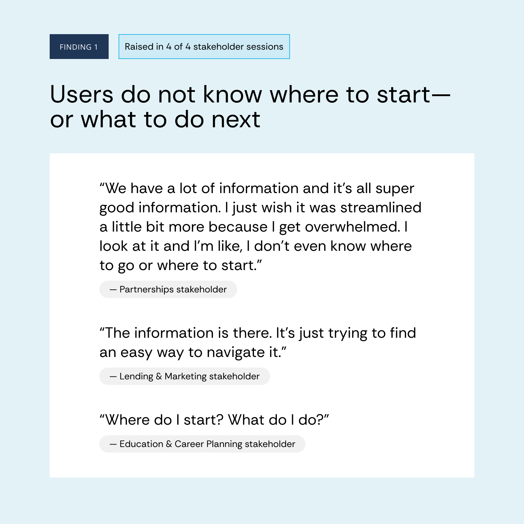
We turned feedback into a simple strategy
Each team saw a different part of the journey. When we brought those perspectives together, three needs kept surfacing:
Help me begin.
Help me continue.
Help me personally.
Those became the foundation for every recommendation that followed.
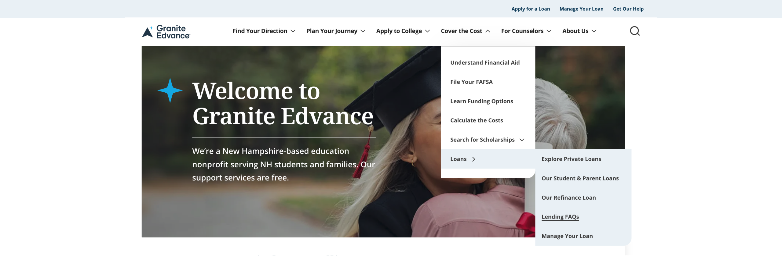
We rebuilt the path, not the whole site
The navigation was reorganized around the student journey, with clearer pathways like Find Your Calling, Plan Your Journey, and Fund Your Future.
The goal was to stop asking users to understand Granite Edvance’s internal structure and start helping them answer a simpler question:
What are you trying to do next?
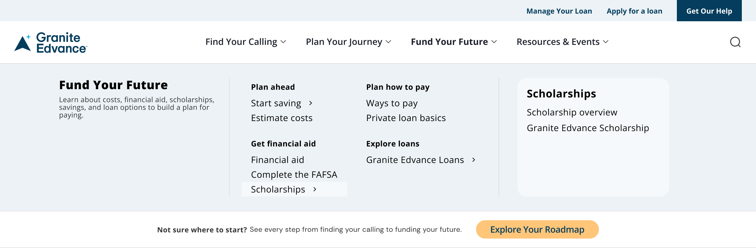
We made the homepage easier to act on
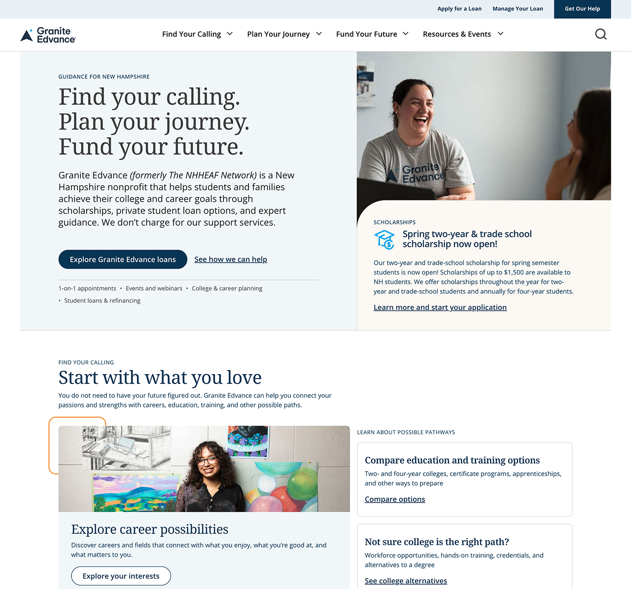
The homepage followed the same strategy.
Instead of making visitors decode broad categories, we surfaced recognizable actions like exploring interests, completing FAFSA, finding scholarships, attending an event, and getting personal help.
Less interpretation. More forward motion.
We connected the moments that mattered
Planning, funding, and personal guidance had previously felt more separate than they did in real life.
We created clearer connections between those moments so students and families could move from one need to the next without having to reorient themselves along the way.
The visible work was simple. The thinking behind it wasn’t.
By the time we moved into navigation, wireframes, mega menus, and homepage content strategy, the hardest questions had already been answered.
- Where were people getting stuck?
- What language made sense?
- What belonged together?
- What needed more prominence?
- What should happen next?
- That is the value of UX strategy.
A cleaner navigation or simpler homepage may look obvious after the fact. But “obvious” is usually the result of research, synthesis, and a lot of decisions made before the interface is ever designed.
You don’t always need a full redesign to create meaningful change
Granite Edvance is a good example of why UX work doesn’t always need to start with tearing a website apart.
Sometimes the highest-impact opportunity is much more focused.
By concentrating on the navigation and homepage — two places that shape nearly every user journey — we were able to reduce friction without rebuilding the entire site.
The result was a clearer experience built around how students and families actually think: where to begin, what to do next, and where to get help.
Because sometimes the biggest UX improvement isn’t a brand-new website. It’s fixing the moments that were making the old one harder to use.