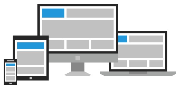
What’s the new buzz in the world of web development? Responsive web design. Responsive web design allows for websites to be automatically re-sized to fit within the boundaries of the viewer’s screen. Although the concept has been around for a few years, responsive design began to take off throughout 2012, and is becoming increasingly more important in 2013. Mashable even deemed 2013 “The Year of Responsive Web Design.”
Why the sudden urgency for this type of layout? Media consumption patterns are quickly changing. Websites are not solely being accessed on desktop and laptop computers anymore, but a variety of tablets and mobile devices have been added to the mix. More people are buying more tablets than ever, and the majority of U.S. mobile phone owners have traded in their feature phones for smart phones. Accessing a traditional website can be slow and aggravating to navigate on these smaller screens.
One way to solve the problem is with mobile applications. GraVoc Media has begun to build custom designed mobile applications to suit our client’s needs. These applications can be a great supplement to a company or organization’s website. They allow for easy access to the company’s information, provided in a trimmed-down layout that fits the mobile screen. They are also a great and exciting tool for on-the-go customer interaction. However, with all the different mobile devices and platforms available, it is time consuming to build separate applications to be compatible with each one. That’s where responsive web design comes in.
Responsive web design bridges the gap between website and mobile application. It provides an effective solution for accessing a website comfortably across any device. GraVoc Media realizes the importance of this adaptability, and has all the tools and knowledge to build these sites for our clients. In fact, we utilized the technology to build our own new site. If you are reading this post on a tablet or smart phone, you are already experiencing responsive design. If you are reading this post on a computer, go ahead and adjust the size of your screen to a smaller width. You will notice the content moving with the screen and not cutting off, so that you can continue to read the post in full. You will also see the main menu compress into a clickable button for more streamlined navigation. Some other responsive sites we have built include Wavelength’s Hair Salon, Vulcan Tools, and Caserta Music. We are also in the works of creating an exciting new site to be launched at the end of March that demonstrates this technology.
Here at GraVoc Media, we have come across an exciting new toolkit to build these mobile applications and responsive sites quickly and effectively: Twitter Bootstrap. Bootstrap was originally engineered by Twitter developers to encourage consistency in design throughout the development of internal applications, and ease internal maintenance. In August of 2011, the technology was released to the public for anyone to use to create beautiful front-end web and application design. The Bootstrap toolkit comes fully equipped with HTML, CSS, and JavaScript, and a variety of additional components and plugins. Also included in the kit, the framework to create responsive layouts. It is fully customizable, and with it we are able to create amazing web and application experiences for our clients and their customers. Check out the Bootstrap showcase to see what’s possible and stay tuned as GraVoc Media releases more responsive websites in the near future!