
You probably never realized how much color plays a huge role in your company’s branding and appearance. Colors evoke emotions and moods from people unlike any other. According to the book ‘Management Decision‘ by Satyendra Singh, people make up their minds within 90 seconds of their initial interactions with websites or products. About 62‐90% of the assessment is based on colors alone.
This is why color plays a huge role in your online appearance. From the color you choose for your headline text to the color you pick for the background, this color scheme will set the mood for your website and ultimately your brand.
How do you know which colors are the right ones for your company? Finding the right colors for your brand is not hard. Ask yourself what does your brand represent? What emotions or feelings do you associate with your brand? Now associate these feelings with their proper color:

Red:
Power, Importance, Youth
Red is an extremely stimulating color. Around the world, red is known as the color of energy. It will attract the most attention and often represents important notices and warnings. If you notice on CNN.com, they use red as an accent color. At the very top of the page they have a scrolling bar for ‘Breaking News’ which they have cleverly made red. They also use the color red to stress important headlines. Using red as an accent color is great if you are trying to draw attention to a specific part of your website. The color red is great for capturing attention. It is the second most visible color, aside from yellow.
If not used right, the color red can work against you. Red can incite anger unintentionally or cause alarm to the viewer. Red can also be associated with danger, violence, fire, anger, and war. If you are going for a more relaxed atmosphere, we would advise you to steer clear of red.
Companies that utilize the color red:
![]()

 Orange:
 Orange:
Friendliness, Energy, Uniqueness
Orange is a warm and vibrant color. It is considered to be energizing while at the same time welcoming. Orange is the only color that was named after an object – the orange. Orange can create a warm, welcoming feeling for your customers that radiates friendliness. Use the color orange when trying to set a warm, and inviting atmosphere. Orange also radiates happiness as it is created by mixing a vibrant red with a cheerful yellow.
Before choosing orange, make sure you know what emotion you are going for as different shades of orange will represent different feelings. As mentioned above, orange usually is a warm and vibrant color. This type of orange is associated with a bright orange. Dark oranges can create a much different feel. Dark shades of orange can show signs of antiqueness or can give off a vintage feel.

Companies that utilize orange:

![]()

Yellow:
Happiness, Enthusiasm, Antiquity
Yellow is an extremely versatile color depending on which shade you choose. Bright yellows glow with enthusiasm and optimism and often provoke thoughts and thinking. Bright yellows will immerse your brand with color and energy. Dark shades of yellow, such as gold, represent antiquity and age. These darker shades are often related with timelessness and wisdom. When dealing with color printing, yellow is one of the ink colors along with Magenta and Cyan.
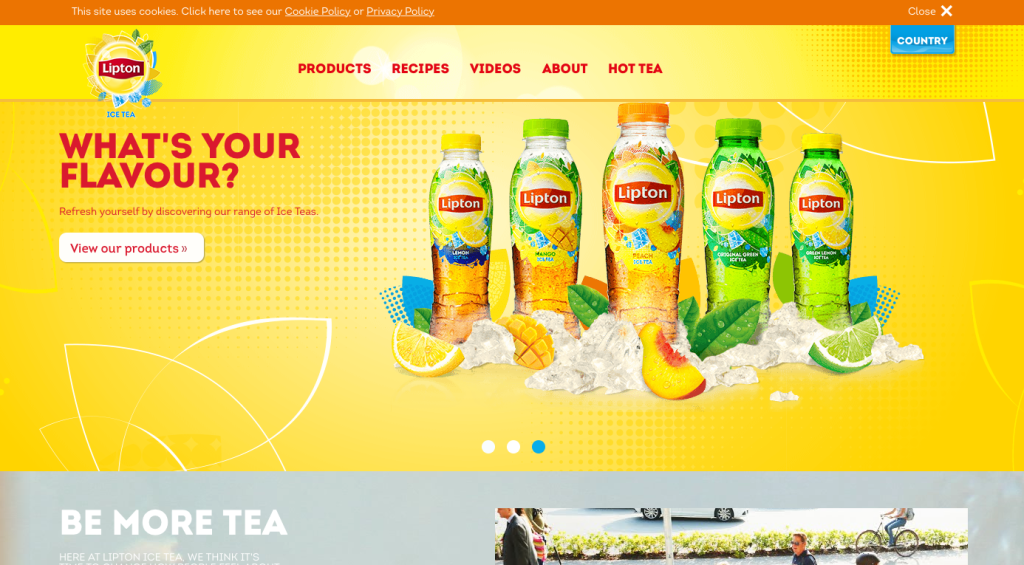
Check out how Lipton Tea utilitizes yellow throughout their website.
Other companies that utilize Yellow in their branding:![]()
![]()


Green:
Growth, Harmony, Renewal
Green gives off many different emotions. One emotion that it gives off is the feeling of growth. Green gives a sense of renewal and restores exhausted energy. This is great to use if you are looking for an environmental or healthy theme as it balances emotions and inspires compassion. Green can also represent stability and endurance. Be cautious when choosing the color green, however, as green often signifies a sense of right and wrong.
Companies that utilize green:


Blue:
Calm, Reliability, Openness
The color blue is often associated with calm and relaxing emotions. Blue is also associated with strength and reliability. The color blue will also emit feelings of loyalty and inner security which is why you may see technology and information security business’ using the color blue.
Social media giants such as Linkedin, Facebook and Twitter all utilize the color blue on their networks. Was this a coincidence or a well-thought out branding strategy? Here are some theories as to why the big 3 all chose to have a blue logo. One theory is that blue is a reflection of intellect and the mind, ultimately making it the color of communication, communication is the basis of social media networks. Another theory is that blue represents reliability and trust which reflects upon all 3 of these networks greatly. And our last theory as to why social media networks tend to use blue is because blue is the most popular color in the world!

Companies that utilize the color blue:

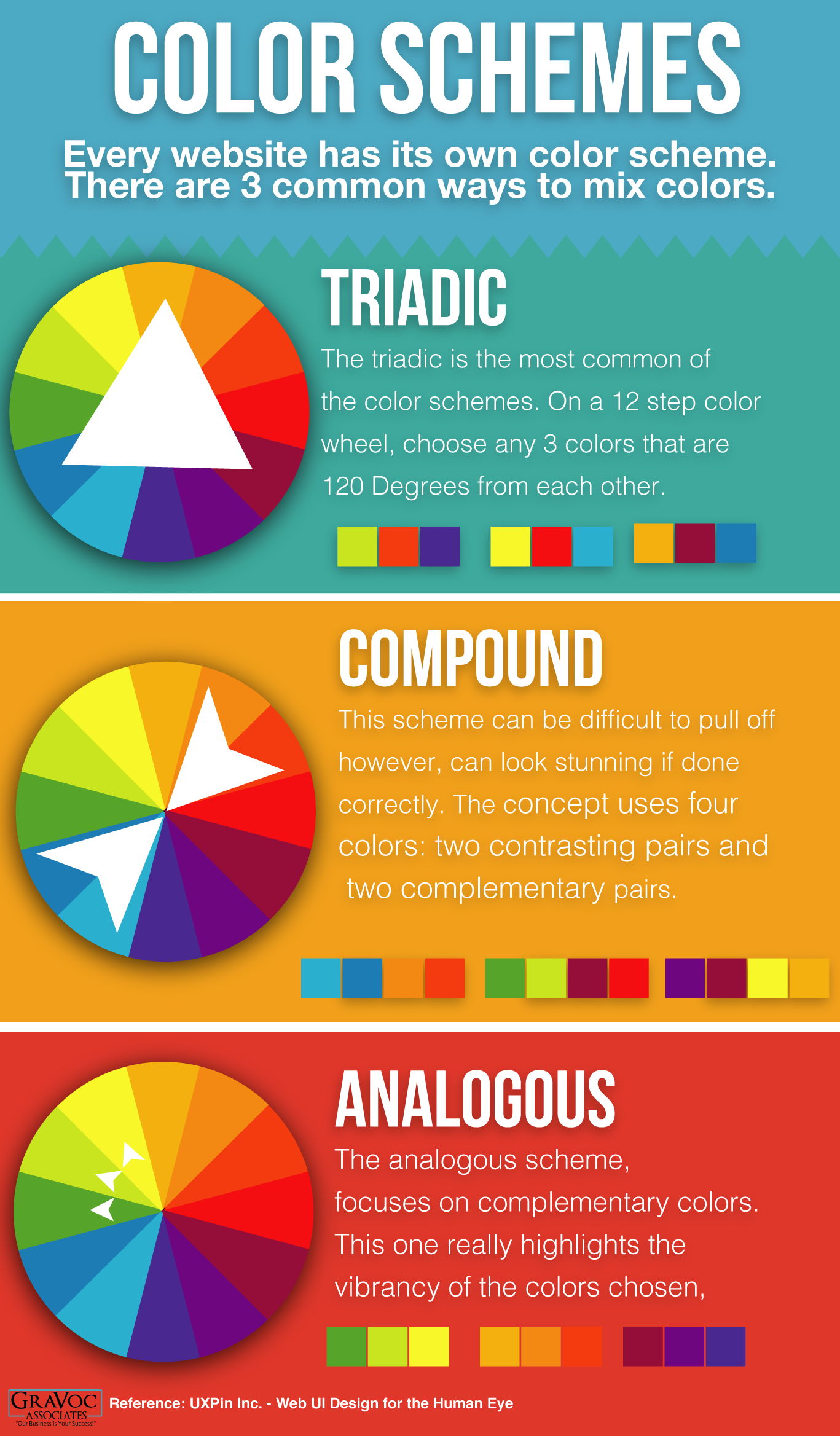
Color Schemes
Useful links
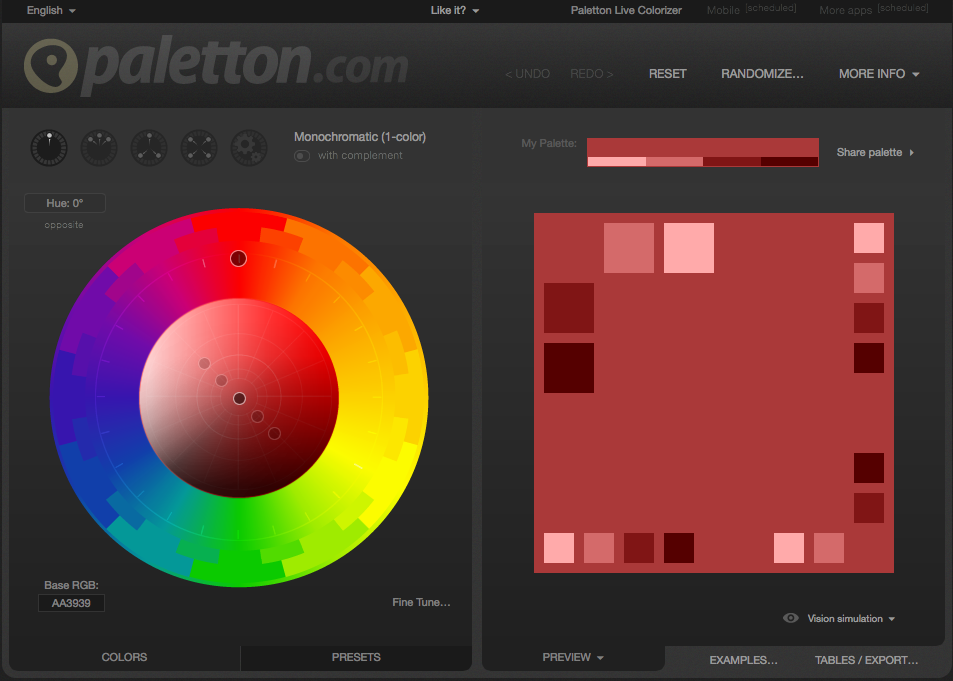
Paletton.com
Adobe Color CC
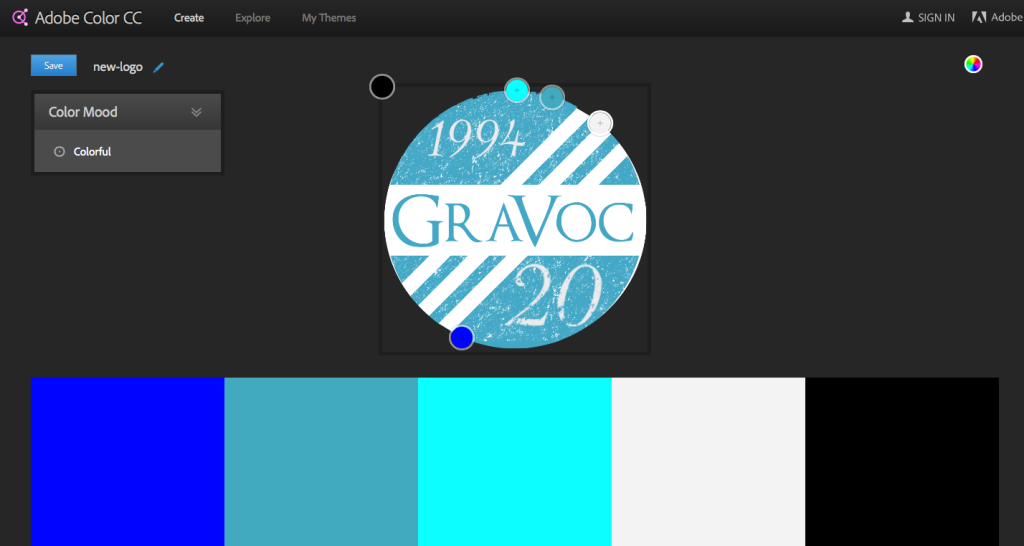 Adobe Color allows you to upload your own image and then generates all the colors that are found in that image.
Visit Adobe Color
Looking for Website Services?
Our developers and designers provide custom website services for businesses looking to revamp their websites or start fresh! Check out our website development page to learn more about our website services and to view our work!
References:
UXPin Inc. – Web UI Design for the Human Eye
https://blog.kissmetrics.com/psychology-of-color-and-conversions/
http://www.emeraldinsight.com/doi/abs/10.1108/00251740610673332
http://www.aliciacowan.com/social-media-and-digital-marketing/strategy-and-advice/social-media-giants-branding
Related articles

How to Make Your eCommerce Store Stand Out
In this blog post, we explore 12 must-have eCommerce website design features to make your online store stand out from the crowd.

Reimagining the Burns Landscape & Snow Management Website
Check out the redesigned Burns Landscape and Snow Management website! Our team optimized the website’s user experience and search visibility.

What is WooCommerce? Your Guide to the WordPress eCommerce Platform
What is WooCommerce? A complete guide to the eCommerce plugin for WordPress, including benefits, extensions, and hosting solutions.